Head of Creative
Control Risks
www.controlrisks.com
Control Risks is a security and strategic intelligence firm trusted by 80% of Fortune 500 organisations across the world. Combining unrivalled expertise, experience and reach with the power of data and technology, they provide the insight and intelligence needed to stay on track, realise opportunities and grow.
Since early 2024, I’ve been leading the evolution of the Creative function from a UK-based production house, to a global, innovative centre of expertise and creativity. My core areas of focus have been hiring & managing a team across regions, developing the brand design evolution, developing the design systems and templates to deliver it, driving strategic, systemic, and operational advancements through writing of policy, integration of AI enhancement, improvement of platform worktools, and cultivating a culture of creativity and curiosity on my team.
Design foundation development
Brand evolution
The Control Risks 50th Celebration campaign
-
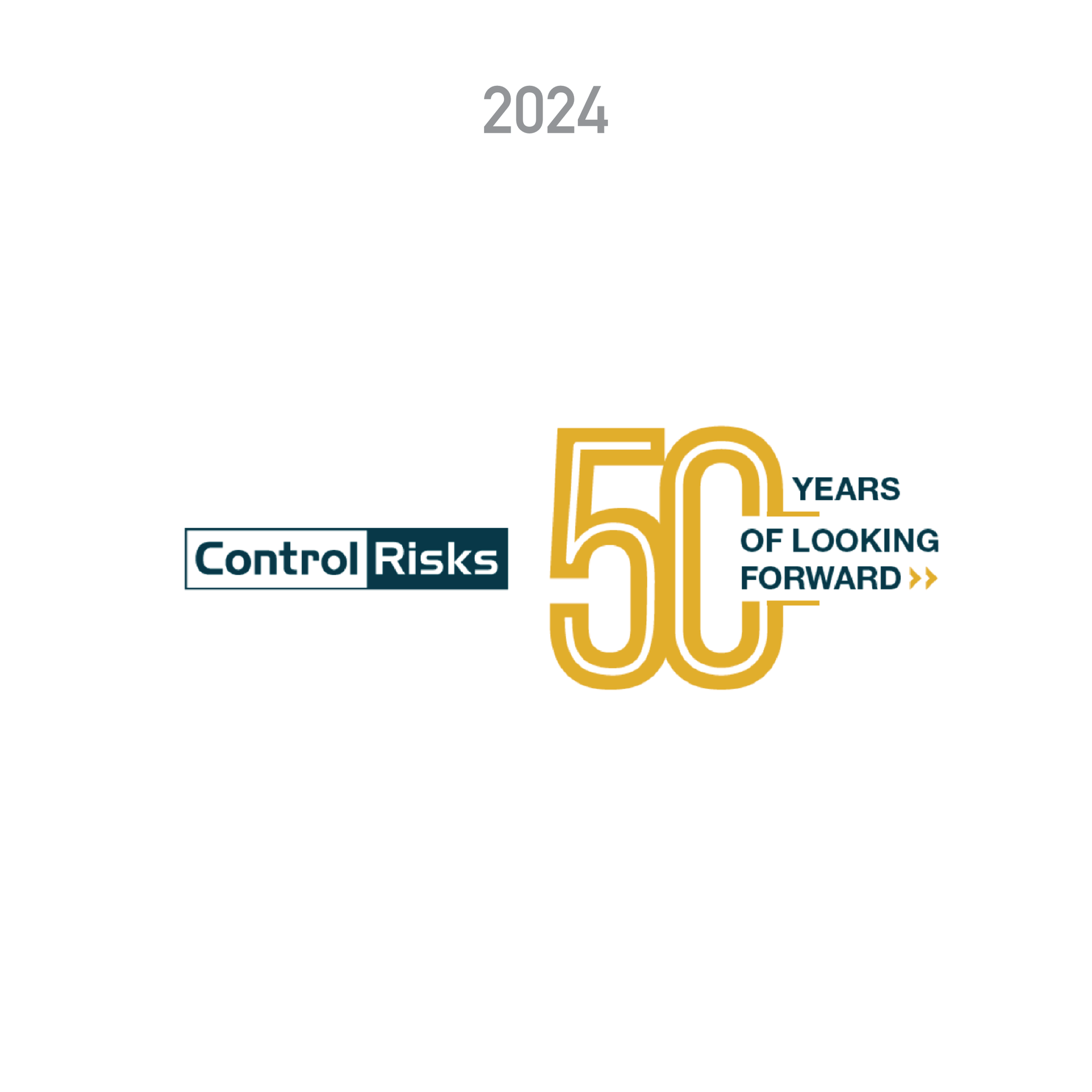
When I began my contract at Control Risks in early 2025, the company was in the early stages of developing a global campaign, celebrating 50 years of serving clients.
-
While a logo had been developed, it did not scale well across digital and merchandising media.
I redesigned the logo, ensuring legibility and accessibility across all media.
-
The original chevron design assets were available in 15 different colourways.
I used the update an an opportunity to simplify the masterbrand colour pallete in its entirety.
First, narrowing down the options to the two colours clients most associated with the brand and then adding a warm gold to act as a complimentary colour to balance out the two blues.
-
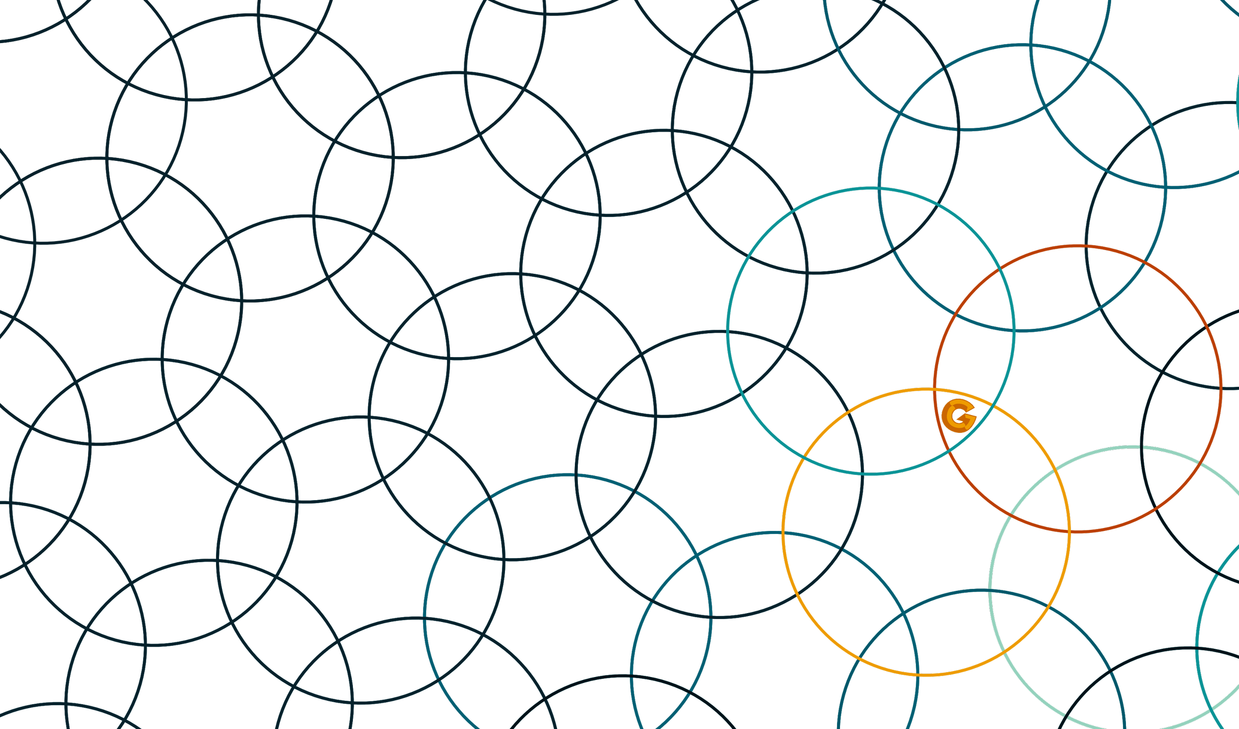
The new logo also elevated the ‘chevron’ arrow brand design asset from something used primarily to point at content, to a foundational story-telling element of the brand.
The redesign of the chevron also made it unique enough that it could be protected legally as Intellectual Property IP.
Operations strategy
Single source
of truth
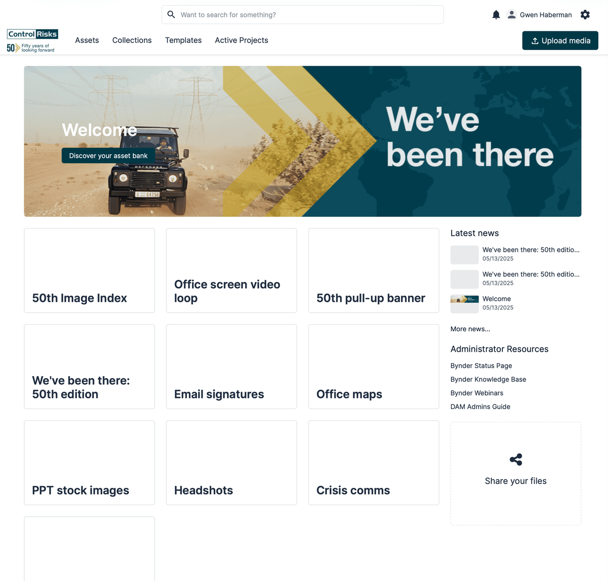
Brand Hub & Global Marketing brief
-
The restructuring of the marketing function as a whole, along with a new global marketing strategy presented the department with an opportunity to develop & build a new operations strategy.
Before the restructure, regional marketing and global brand colleagues had a wide variety of ways of working and briefing in new work.
In addition to the introduction of Agile practices, such as morning stand-ups to improve team workflow, I was able to identify three keys ways to connect colleagues to the marketing strategy, improve communications across the team and help create a culture of transparency.
-
Working with industry best practices as well as the new business and marketing strategies, I created a Global Marketing brief to help marketers lead their engagement with business stakeholders in strategically aligned, consistent ways.
-
The channels of communication between colleagues was organic and sometimes resulted on duplication of efforts and misunderstandings.
To mitigate this, I developed dedicated channels of communication around the Marketing strategic programs for daily communications, with regular, meetings between Brand and Marketing program leaders.
This has resulted in the number of siloed conversations and greater transparency across the global team.
-
I have many years of experience of developing and evolving digital brand platforms.
In a previous role at the Global bank HSBC, I developed the first Global Marketing Brand hub for the company.
These experiences have helped me to understand the immense value that centralised, shared team resources bring to team performance and culture.
In my role as Head of Creative at Control Risks, I have been mentoring a junior operations colleague in the development of an Operations hub, leading in the development of file and folder naming conventions and project workflow strategies. In addition to this I am a key contributor to the development of a new Brand hub.
Culture building
Connecting brand & values
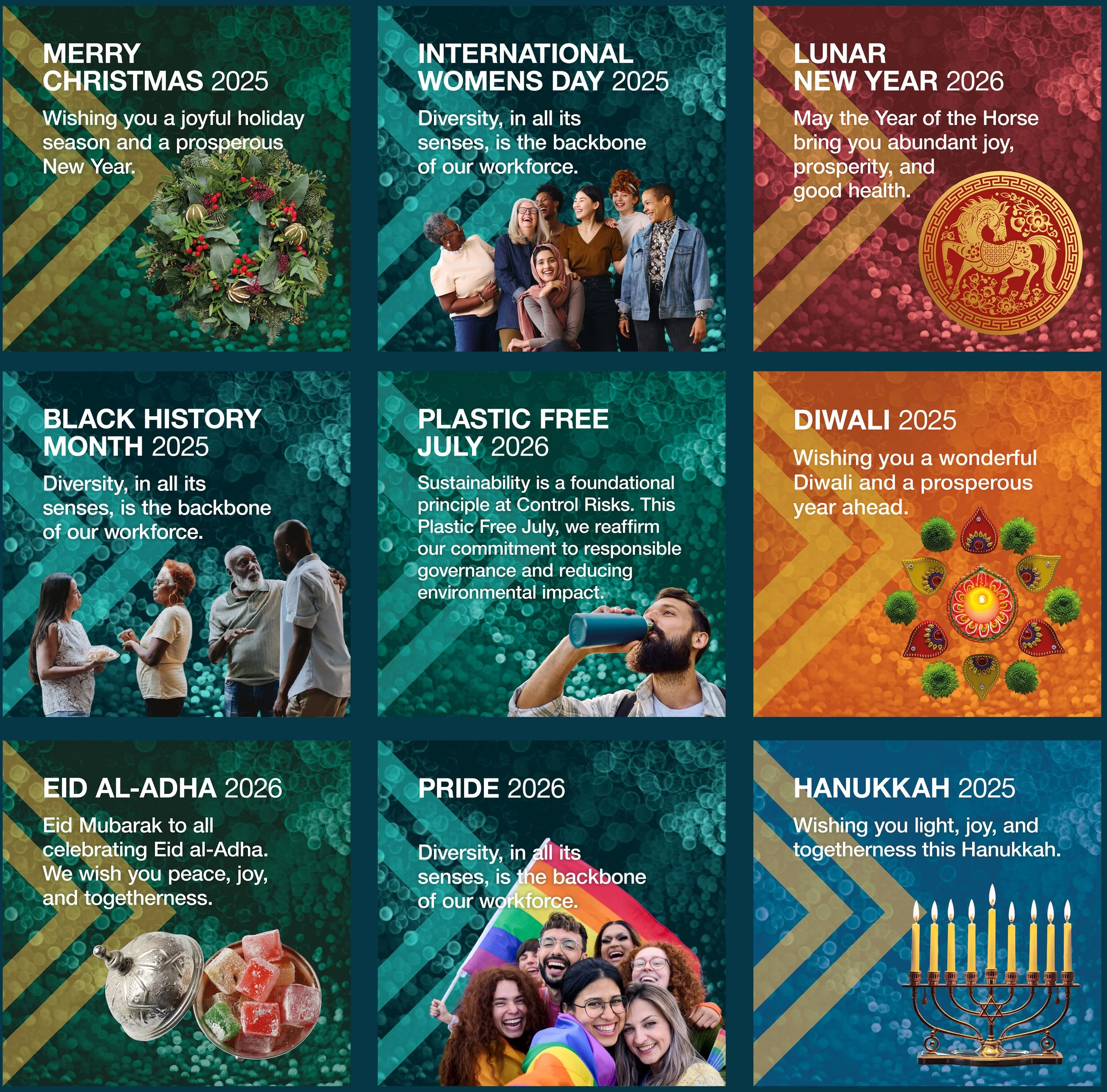
The Control Risks
Global Awareness & Celebrations
design system.
-
2025 saw the US government openly attacking many D&I initiatives and global awareness campaigns. This caused me to do some soul searching on how my organisation could continue to support global awareness campaigns while avoiding political attacks.
By leading with the master brand and corporate values, instead of using the brand design assets of global awareness campaigns, I was able to connect the importance of diversity and inclusion to the brand’s ability to provide industry-leading products and services.
-
Before 2025, Employee Resource Groups were left to their own devices to develop communications materials around their awareness subjects.
I created a Global Awareness & Celebrations brief to engage internal ERG’s with.
The result was a unifying design system and collection of globally aligned assets that employees felt proud and excited to use.
-
If the creative teams that deliver BAU work are not key stakeholders in the brand’s evolution, then the customer experience can suffer. That’s why I brief much of the brand evolution into my creative team and support with Creative and Art Direction, instead of doing it directly myself. The development of this design system was briefed into a senior designer who I guided to develop a comprehensive design system that will serve the brand for years to come.
Senior Global Brand Design Manager
HSBC Group
www.hsbc.com
Founded in 1865, HSBC is one of the world’s largest banking and financial services organisations.
During my tenure at this incredibly diverse company, I lead the evolution of some of the Global Brand Design Foundations guidelines and systems, developed their regional variations, connected a global creative community, while working across global functions to create an aligned customer and employee experience.
Please note that due to the security measures of the financial industry, the image quality of my work while at HSBC is not as high as work done in other industries.
Solving regional to scale global
Planting a seed in Singapore
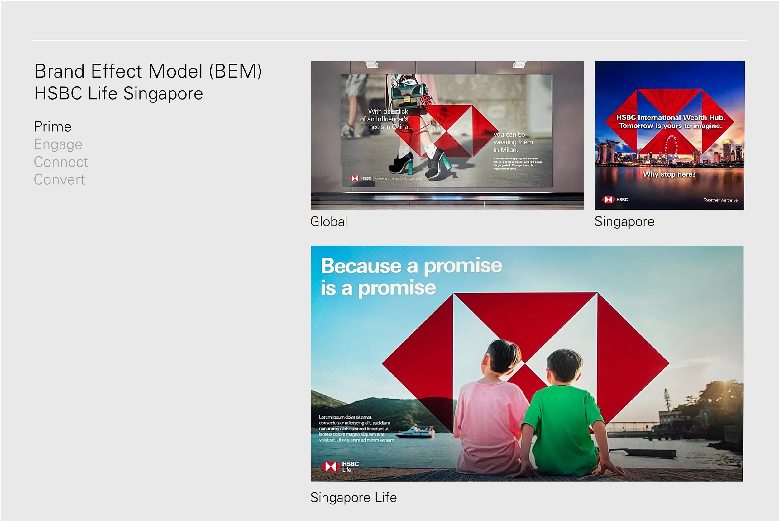
The HSBC Life global brand strategy
within the Singapore customer journey
-
The HSBC global brand strategy had recently changed from a ‘House of Brands’ to a ‘Branded House’. This change left some of our sub-brands in need of an update.
I led the program to review our Insurance sub-brand, Life, which was one of our most independently branded products.
An insurance acquisition in Singapore, which needed to be rebranded into the HSBC Life brand gave me the opportunity to use the regional engagement as a PoC to solve the larger global rebrand strategy.
-
Working with senior stakeholders across Singapore, Hong Kong, China and the UK, I used the acquisition to raise awareness with senior stakeholders on the new brand strategy and co-create how HSBC Life, as well as a new Financial Advisory product being developed in the region, were going to work within the new approach.
-
I worked with a local Singapore agency to develop creative territory for the product within the global brand strategy, demising the unique logo and using reserved colour palette variations within branded photography.
Solving this regional product rebrand helped me to define how products and services would live in the new ‘Branded house’ strategy of HSBC.
The process of agency and key stakeholder engagement deepened their understanding of the strategy and converted them into champions of it.
Once proven across regions, I created guidelines, workshops, assets and templates, as well as supporting communication content and workshops to update the creative community.
Culture building
Creative connections
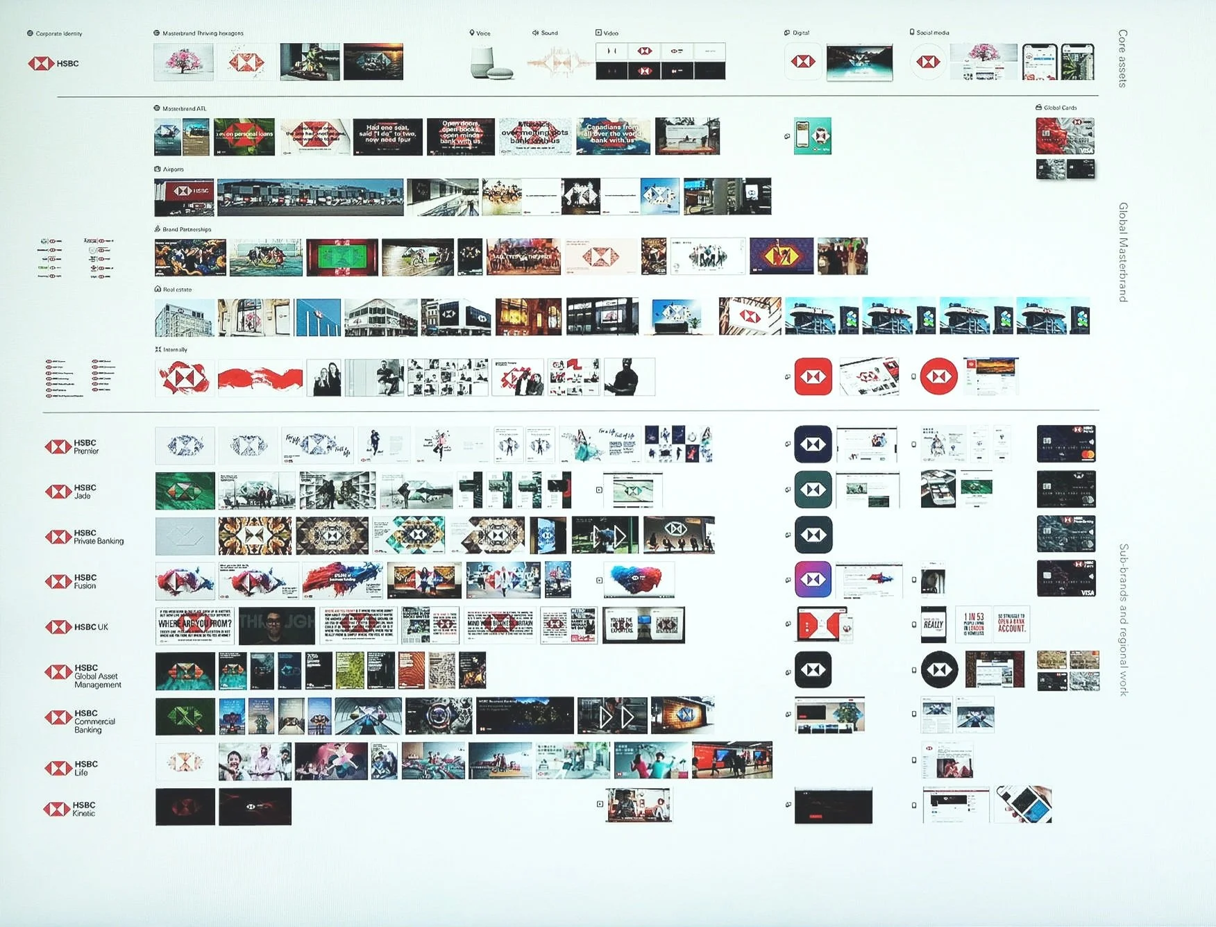
Mural board with bird’s-eye-view of creative work from across the company,
arranged into a map of the Marketing Funnel
-
In multi-region, multi-product brands, creatives can struggle to understand their brief in the wider customer experience and brand guardrails. This often means a lot of creative efforts and budget that could have been used more wisely.
I’ve developed several programmes to help build a culture of cross pollination and sharing across HSBC’s communities of creatives and brief owners.
-
I’ve written articles, developed programmes and workshops to introduce creators to the brand foundations and their nuances.
However, I found that across the creative community, people were working in siloes, using the global creative team as their core connection to the brand.
I partnered with key creative communities to build a ‘bird’s eye view’ of the creative work being done for the Master and sub-brands so that they could begin to be more aware of each others work directly.
When digital white board programmes came into the industry, Mural was brought onboard at HSBC. The concept of bringing all creative together to map the customer experience was then able to turn into a real time community building programme.
-
Creative brief owners across regions were duplicating briefs and budget spend. I developed a Monday.com-based forum as a way for them to come together before engaging agencies.
I used this channel to help create one comprehensive global brief across regions that would go to the best agency to deliver comprehensive, high quality globally licensed assets.
-
Global brands that have grown large through acquisition have unique brand challenges. They may have legacy font licenses creative assets and teams.
To help manage such a sprawling landscape, I partnered with our IT department to create a passive brand on-boarding and management program. This was designed to limit internal content creators to brand approved assets and automatically give them access to brand platforms and resources.
Brand architecture
Simplicity born from complexity
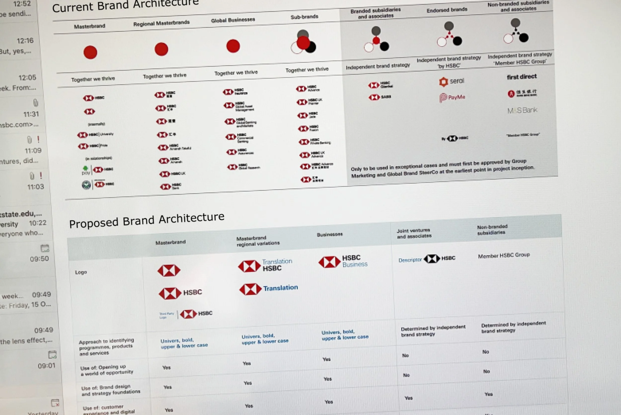
Global Brand Trademark Architecture
-
HSBCs customers are digitally fluent and global travelers, however as they lived their international lives, they could be seeing very different versions of the HSBC brand.
To ensure a consistent customer experience, I created a Global Brand Architecture.
This reference then helped regions to understand the importance of building trust through consistent use of the brand foundations and reduced time spent in product and services brand development negotiations.
-
While this design system was a tool to create consistency, it also needed to include a level of flexibility.
For example, in this system, the bilingual logos solved for most regions, however when the framework was proposed in Hong Kong, there was necessary co-creation with the region to develop a logo that was in harmony with the principles of Feng Shui, an important aspect of that region.
-
Organizations that involve large amounts of product and services development can struggle with creating a unified approach to how they're branded.
This framework was developed from the Branded House Strategy, with a robust foundation of logic and research. It became a very useful tool to manage and align internal expectations for where the creative territory was for branding new offerings.
Creative leadership
Soft skills:
the new
hard skills
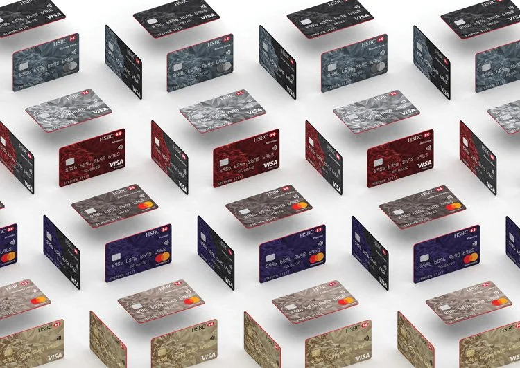
Global credit and debit card system
image credit: Shift
-
From my many years in the Creative Industry, I have a clear understanding of the frameworks and tools that foster creative, engaged design teams. I have a proven track record of bringing siloed teams together around the brand purpose and being a reliable translator across regions and disciplines.
-
HSBC hired Shift, an agency in Hong Kong, to create a global system for its credit card design.
Credit card are a challenging media to design for in that the industry guidelines for their design are evolving quickly, however the production time can be many months. Desirable design attributes can be cost prohibitive and in most cases, they are done in partnership with a third party, such as MasterCard.
I worked closely with the product owner and Shift to guide the solution to something that could expand into a design system, that could meet the complex needs of the bank and the industry.
The end result then catapulted the card portfolio into an important part of the strategic brand real estate.
Connecting with creatives and understanding the nuances of their region or the challenges of the briefs media were some of the things I enjoyed the most during my time creative directing for countless agency briefs from across HSBC's regions.
-
The most inspirational responses to a brief can fragment a customer experience if there is a misunderstanding of the brand design foundations and how they are used.
To avoid this, for the most recent HSBC rebrand, I developed a series of workshops, editorial publishing, guidelines and templates designed to help teams understand where we connect with our audience through creativity and where we build trust through consistent use of the brand foundations.
I help designers and agencies understand some of the more nuanced guardrails their responses to briefs have to deliver within, such as legal IP and trademark, through the creation of editorial content, guidelines, and product naming frameworks.
I have led complex licensing, policy and procurement contract frameworks and content to help creatives navigate brand risk and relationships.
-
During my career, I have arranged team access to creative personal development platforms, inspirational team outings to museums and design festivals and sometimes more nonlinear experiences that build team cohesiveness in different ways, such as team rock climbing course.
As a part of my role at HSBC I acted as a mentor for colleagues creating communications and design systems for the brand.
Creative scaling
A mobile phone in the UK.
A building in Hong Kong.
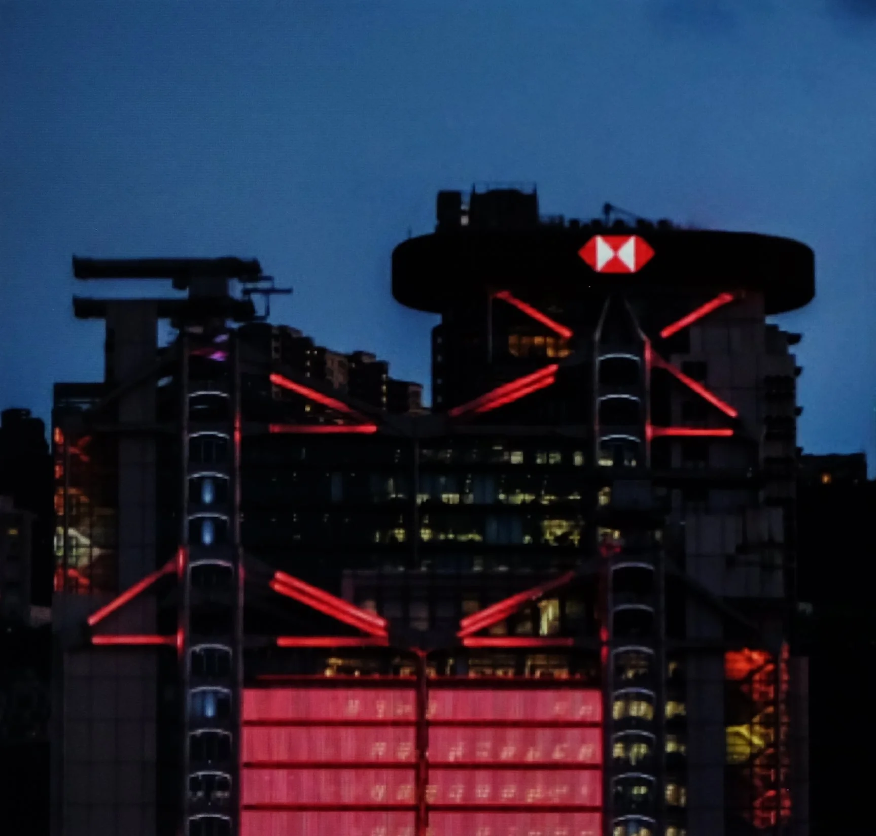
HSBC HK building with rebranded crown
-
Every time an old technology is replaced by a new one it is likely it will have a strategic impact. This was the case when the traditionally lit crown of the HSBC Hong Kong building was updated to a LED digital screen.
The building itself is already an icon in Hong Kong because of its digital display that was installed in 2003 across the front of the building. Now we had installed technology that was even brighter and more vibrant across its iconic crown.
I led the program to understand the implications this brought, to provide a new design approach that spanned across space and time, and develop guidelines for how the space should be used.
-
The first thing I wanted to understand was how residents of Hong Kong felt about the light shows. Did they enjoy them? At the same time I became aware of the negative impact that light pollution can have on wildlife. Would this be adding to that?
My research uncovered that while the building was appreciated for its iconic presence in the skyline, local residents actually found it an eyesore and disruptive. According to the scientific community, it was likely that the building was disrupting local wildlife as well.
-
As I was researching solutions, I was also giving feedback to a team that was developing new mobile Dark Mode guidelines for our mobile applications, among many other projects.
As I read through the guidelines, it became clear that many of the fundamental principles for accessible mobile experiences were the same for communities experiencing our epic digital screens.
I repurposed the relevant concepts and colour palettes and used it as a foundation to create a set of guidance for all HSBC digital display screens that included both content strategies and design direction for master brand spaces, such as top of buildings.
Like mobile phones, during the day the logo was on a light background, but then transitioned to Dark Mode as the sun went down.
This approached reduced significant light pollution from the top of the building.
The logo is static most of the time, but animated, subtly, every hour on the hour.
Hong Kongers can now use the HSBC logo to keep track of time. A very small benefit, but something to let them know we were thinking about them.